LOGO / PACKAGING / WEBSITE
APTOSOL
2020
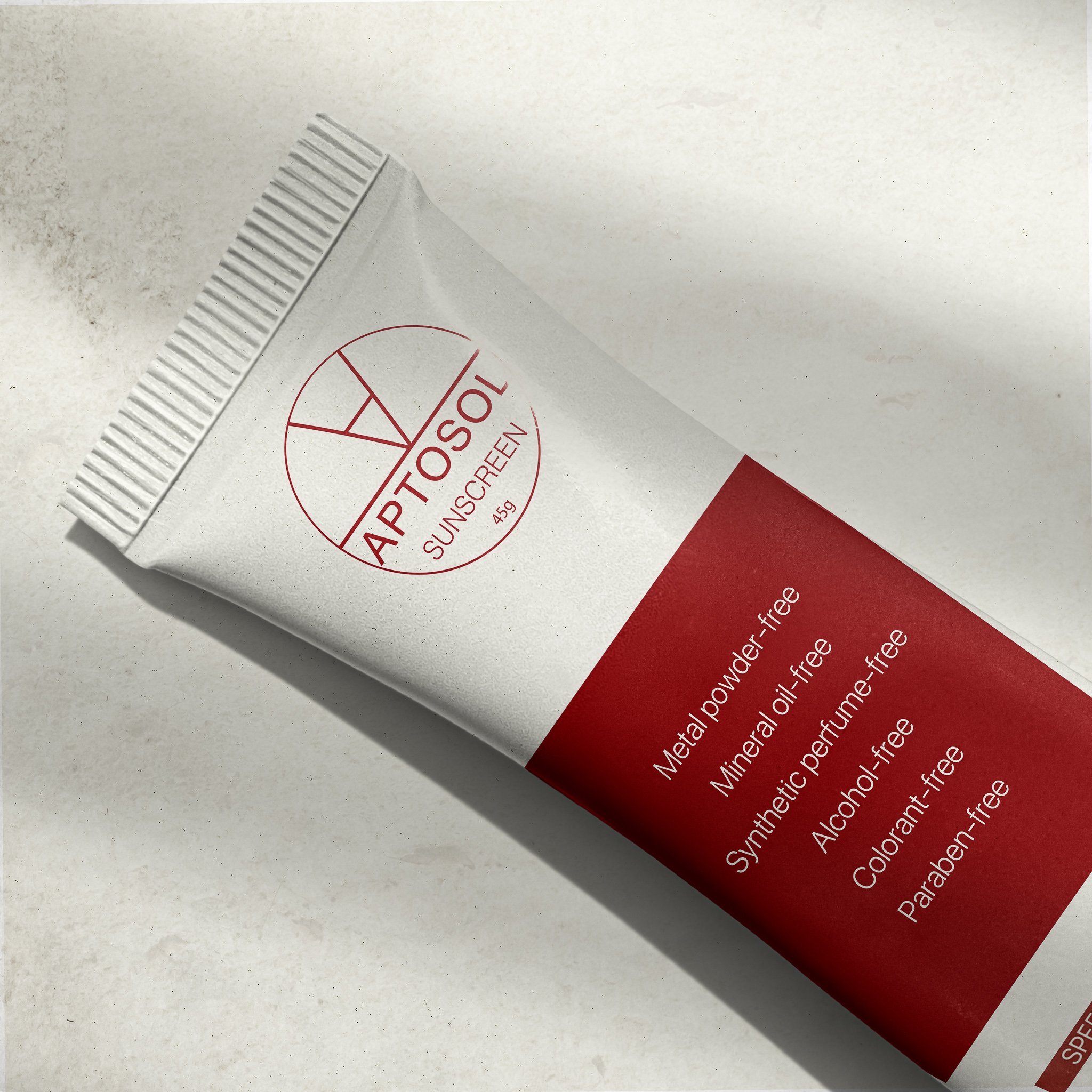
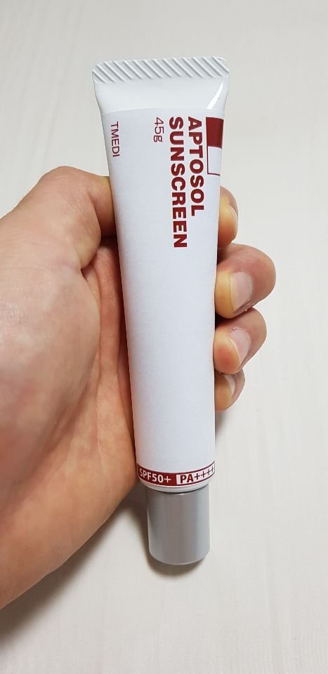
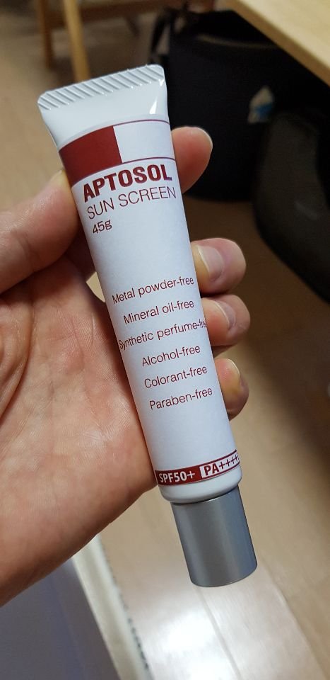
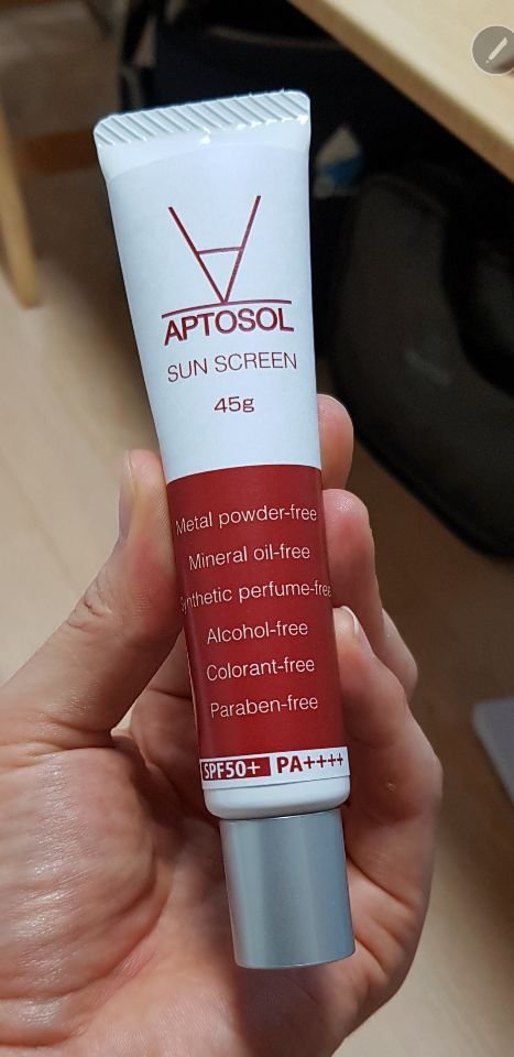
“APTOSOL” is a sunscreen brand that provides effective UV protection effects using their own technology, which is different from existing products. Overall, we have devised a package design that can trust and expose the effectiveness of this product to people only with a simple design using shapes.


Logo Identities.
APTOSOL sunscreen complements the white cast phenomenon of general sunscreen, which is a disadvantage and is applied thinly to the skin surface while completely blocking UV rays. In order to effectively reveal this, the idea was conceived as a diagram comparing APTOSOL products with other companies products.


Package
TUBE / BOX PACKAGING
Overall, the package used white and red colors used in logo colors. The box containing the product is composed of the same color as the logo, and the logo and product description are unified in white to design neatly. On the contrary, the product used a red line of logos and letters on a white background. The overall text adds a refined sense with letter arrangements using various layouts. In addition, the layer was adjusted by adjusting the thickness of the letters.
Planner figure


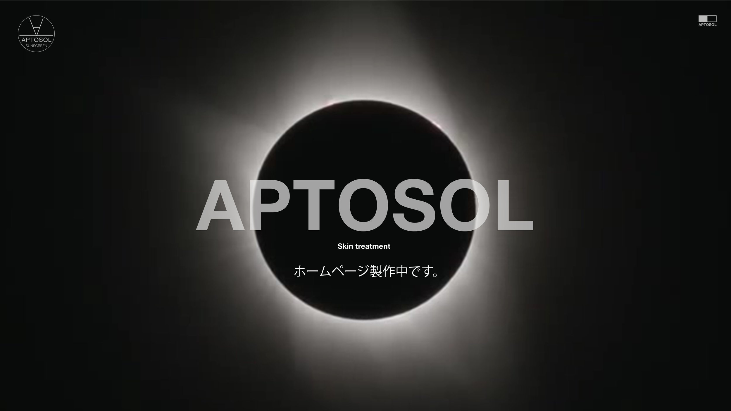
WEBDESIGN
Website
The only thing that happened was that the existing domain-style homepages were hard and commercial. I have come up with newer, more interesting, and novel ideas. The concept is alien. Alien life has a mysterious image. I've expressed them coming down to Earth and finding sunscreen. The public will be shocked at the first connection. As the color and identity of the product are sought to be clearly identified, APTOSOL is shown with its unusual design and entertainment.

